Logo
Ewasoft represents the essence of quality software topped off with good design.
In every situation our logo represents our professional accomplishments and everything we stand for as a company.
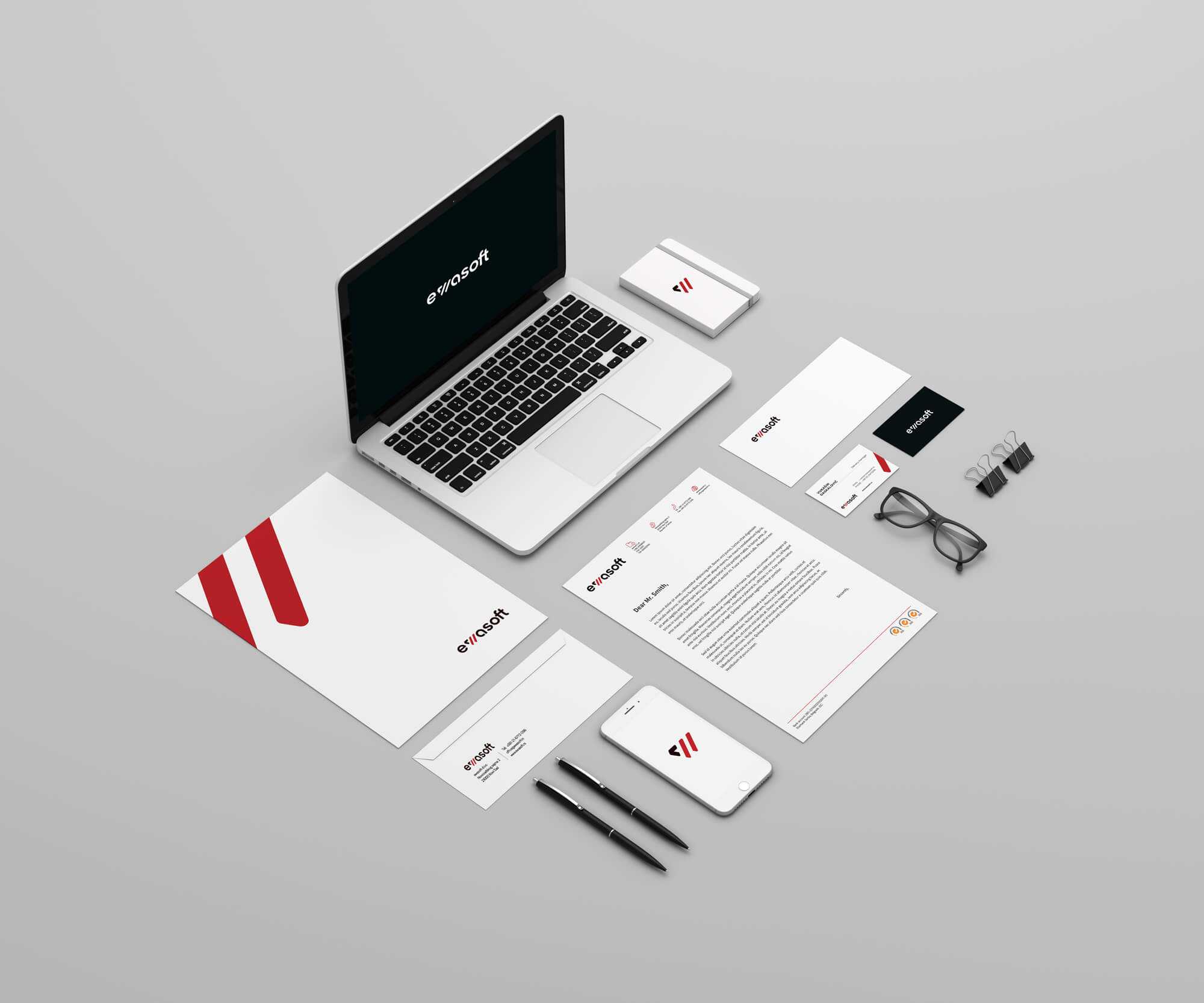
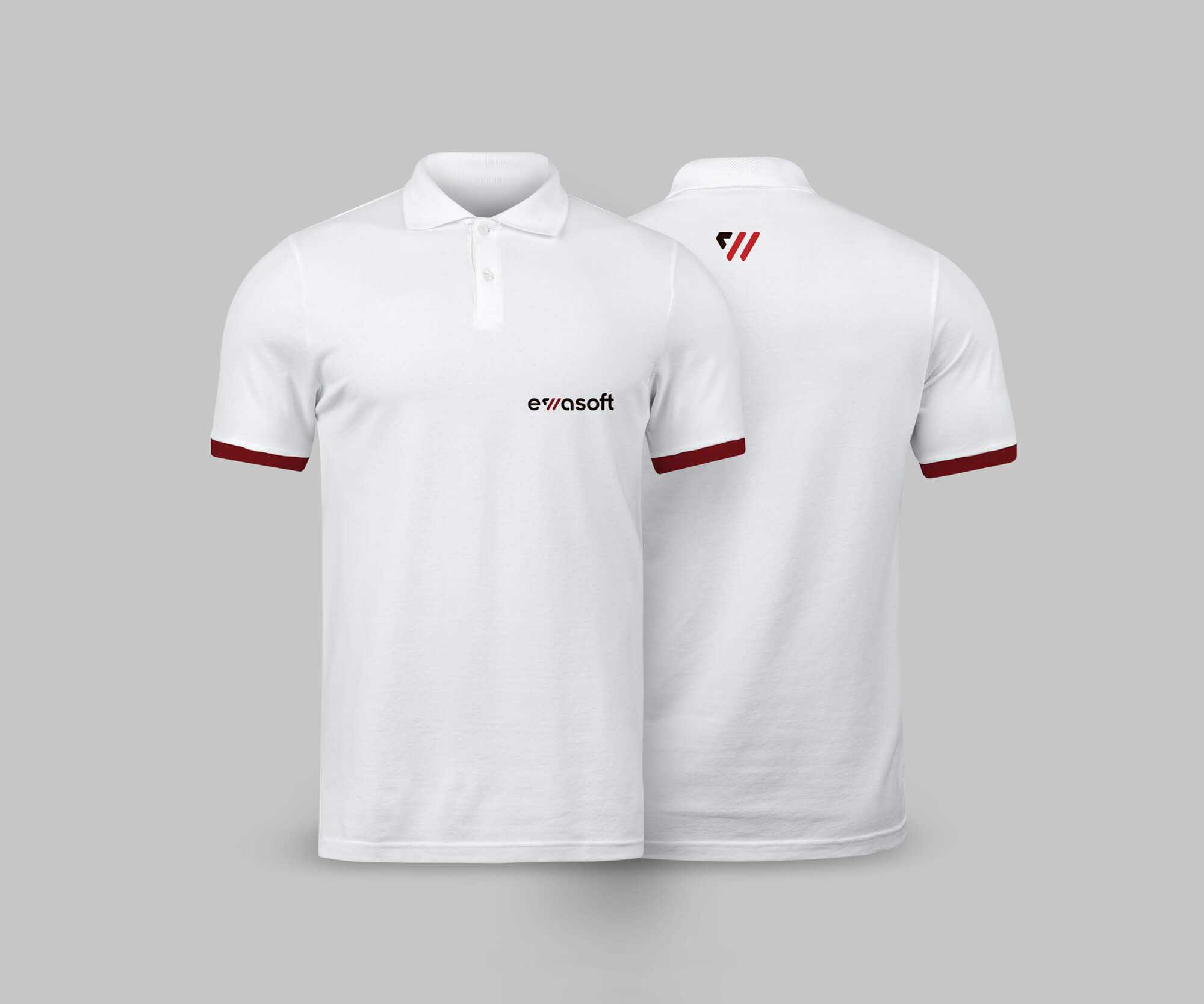
In its primary state, the logo is a black and red wordmark on a white background. Given that its a dual color logo, several versions were created to help it adapt in various situations.
As a rule of thumb however, the logo must be put on a simple, single-color background which does not compromise its visibility and legibility.
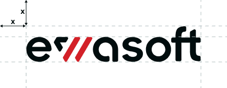
Clear space
Clear space is the area that is required around the outside of the logo. It must be kept free of other graphic elements such as headlines, text, images and the outside edge of materials.
The minimum required clear space for the logo is defined by the measurement “x” . This measurement is equal to the height of the wordmark’s letter e.
Logo application
The logo should, whenever possible, be used on a simple or single color background in the version which gives the biggest contrast. This is meant to ensure the best visibility of the logo.
originalEwa black & ewa red
white for dark backgroundsWhite
print originalRich black & Ewa red
white for red backgroundsWhite
print monochromeRich black
Logo variation
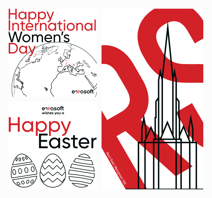
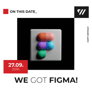
Ewasoft’s W can be used as a variation of the full wordmark logo. The lettermark can be used as a standalone logo or a graphic detail.
When used as a graphic detail, the lettermark can be used in any approved ewasoft color or different blending modes.
originalEwa black & ewa red
white for dark backgroundsWhite
print originalRich black & Ewa red
white for red backgroundsWhite
print monochromeRich black
ERP and POS
Ewasoft’s brands have their own logos, ones derived from the ewasoft brand. These logos also come with a variation which can be used as an icon or whenever it would fit the design better than a full wordmark.
The colors used in these logos are the Ewa brand colors. Ewa black and Ewa gray are used in web and rich black and print gray for printing purposes.
F Webshop
F-webshop’s original logo consists of the logomark and wordmark in E webshop Red and Light Gray. When used on a dark background the Gray should be swapped out with white. Make sure to remember that the version of the logo for a red background uses Dark Gray and white instead of Light Gray.
Unlike Ewasoft, F webshop doesnt have a monochrome version.
Proper use
It is important to protect the integrity of the brand.
This means that the logo must always be used in the proper, approved way. Any modification of the logo that confuses it’s meaning and diminishes it’s impact, is not allowed.
As shown in these examples, the logo must never be skewed or flattened, given a drop shadow, changed to an unapproved color (even from the ewasoft color palette), or put on a background which will impair its legibility.
Never redraw, translate or otherwise alter the logo in any way.


